I help teams turn early ideas into clear product stories, interfaces, prototypes, and production-ready experiences. My work sits between interaction design, visual systems, motion, and the conversations needed to get ambitious products shipped.
Interaction design · UX/UI · Motion · Visual design · Prototyping
Featured work
At Lightyear, I worked across the digital experience of a solar electric vehicle: instrument cluster, infotainment, companion concepts, interaction flows, prototypes, and stakeholder alignment. The work below highlights three recurring challenges: explaining solar charging, supporting spontaneous trips, and making climate control feel safe and simple.

Clarity first
The interface had to reduce cognitive load while the driver’s attention stayed on the road. Every screen needed to make the next action obvious without hiding important system feedback.
Data with purpose
Solar charging created unfamiliar behavior for drivers, so the product had to translate live and historical energy data into simple decisions: park here, keep going, or charge elsewhere.
Confidence and control
Drivers should feel free to explore, make small mistakes, and recover quickly. The design language balanced playfulness with the reliability expected inside a vehicle.

Lightyear 0
Role
Product design, UX, prototyping
Scope
Cluster · Infotainment · Companion concept
Year
Lightyear 0
Case study
My contribution
Benchmarking, user research, information architecture, user flows, Hi-Fi prototyping, user tests, stakeholder management, implementation support
Design challenge
The challenge was not simply showing more data. It was making a new kind of charging behavior feel predictable, useful, and calm.

Design challenge
Solar gain can look small day by day, yet it changes how people think about range. We used the car’s digital touchpoints to explain that value in context.
The car charges about 8-10% per day, which may not seem like much, but it can translate to up to 75km daily. Considering the average commute distance in the Netherlands is 23km, this means a carefree driving experience for three months in the summer. Of course, this varies depending on the user’s driving style and car usage. We need to convey this information to the user.
Lightyear, the world’s first solar car for families, offers a unique experience to end-users. However, questions like how long it takes to charge to 100% still linger. The bigger question here is: does the user even need to think about charging the car? At Lightyear, our goal is to provide a seamless and effortless car experience, where charging becomes a non-issue. Ultimate convenience an in-depth understanding of the car’s workings.
We wanted to utilized our digital touchpoints to educate users on how a solar car operates. I spearheaded the development of the initial concept, which led to the deployment of an app, instrument cluster, and infotainment touchpoint. The entire process, from defining the problem to user testing and implementation, took approximately three years. The screens showcase Lightyear’s main USP and provide an in-depth understanding of the car’s workings.
Product key features
Three touchpoints worked together: the cluster for glanceable status, infotainment for exploration, and the companion experience for planning and learning.
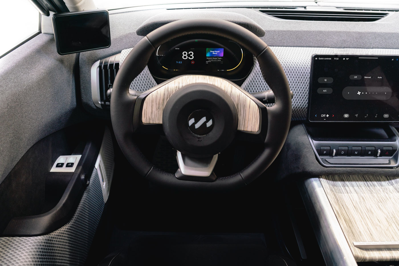
The instrument cluster displays a bar that fluctuates based on the amount of energy yielded, up to a maximum of 1140 watts. Additionally, we deliberately chose a yellow hue that blends in with the white background, enabling you to estimate the energy you have at a glance without interfering with any critical driving information.
For those who require more detailed information, a top-down shot can be accessed on the infotainment screen to provide transparency about our technology. This allows you to visually detect any issues with your panels, whether it’s a shadow caused by a streetlight or the aftermath of a bird’s work.
Finally, our historical and predictive screens should answer any questions you may have about your charging needs, such as whether you should park your car on the street or in your carport to avoid the rain, or how much charge your Tesla-driving friend had over the past year.


Top 5 goals
What I wanted to achieve
Process
The process moved from a simple idea — show the solar gain — into a much deeper question: how much information is useful while someone is driving?
Based on the principles and goals I described earlier, we developed a plan to make the solar charging process automatic for the user. However, this created a conflict as we realized that many users actually want to actively pursue the benefits of solar charging. After numerous discussions, we found that people enjoy actively chasing the sun and being involved in the process.
The first step was to distinguish between energy charged from a regular source and energy charged from solar power. By making users aware of the solar energy, they can better understand the amount of free energy available to them. We focused on subtly incorporating hints of solar energy throughout the system to gradually build up this energy reserve over time.
Solar charging is a slow and passive process, which has led some to explore high-tech solutions like 3D mapping to locate optimal charging spots. However, while these features may look impressive, they may not be particularly practical in terms of enhancing the overall solar charging experience.
Going through the entire design process, from user stories and information architecture to ideation, high-fidelity prototyping, and user testing, we realized that the solar charging app should feel more like a health app, focused on tracking and presenting the right information at the right time on the right screen – no more and no less.


Results and lessons learned
The concept helped people understand the promise of solar mobility. Even before a large customer base existed, prototypes and tests revealed which explanations created trust and which ones added noise.
Coming up with concepts may be easy, but bringing them to life can be challenging, especially when multiple stakeholders are involved in the process.
Presenting data effectively requires more than one screen. It’s important to consider the flow of information and how it can be organized to provide a clear and comprehensive understanding of the data.
People find it easier to understand the data if it is presented in a format similar to that of an Apple Watch interface. Therefore, when designing the data presentation, it’s important to consider using a simple, intuitive interface that presents the information in a clear and concise manner.
People tend to fall into two categories when it comes to their interest in data: those who don’t care much about it and those who want to know everything.
Sometimes it can be challenging to justify investing in the development of a feature that is seen as simply “cool” without clear evidence of its value or impact on the user experience or business goals. Or vice versa.
Please watch this fantastic video from Fully Charged, highlighting the early preproduction solar app.
Lightyear 0
Role
UX strategy, flows, prototypes
Scope
Routing · Charging · Driver confidence
Context
Pre-production vehicle UX
Case study
My contribution
Benchmarking, user research, information architecture, user flows, Hi-Fi prototyping, user tests, stakeholder management, implementation support
Design challenge
The navigation experience needed to feel ever-present without becoming another system that demanded constant management.
This challenge requires us to find innovative solutions that take into account the unique variables of the Lightyear 0, including its smaller battery, higher efficiency, and solar charging capabilities. Ultimately, our goal is to create a user experience that gives Lightyear 0 drivers the same sense of freedom and peace of mind that drivers of ICE vehicles enjoy.
How might we create an effortless and seamless experience for Lightyear 0 drivers, enabling them to drive spontaneously without worrying about the limitations of EV charging infrastructure?

Product key features
Our vision for the navigation system was to make it an ever-present guide that supports you without being intrusive. Wherever your journey takes you, our navigation system is there to assist you every step of the way.
Planning a trip using onboard systems can be tedious and inconvenient, especially since many cars lack them, leaving users with slow or outdated companion apps. To address this, we’ve introduced a new feature that allows users to focus on the first stop of their trip while still showing the entire route. This promotes flexibility and simplifies the information overview, making it easier for users to adjust their plans on the go.
We have planned a feature to predict the user’s destination based on their navigation usage, as we found that most users use navigation to avoid traffic jams. We’re exploring the possibility of implementing this feature in the background, which would proactively notify the user if they need to charge somewhere or if they can make it to their destination.
Or, of course, need to reroute for a traffic jam.
Top 5 goals
What I wanted to achieve


Process
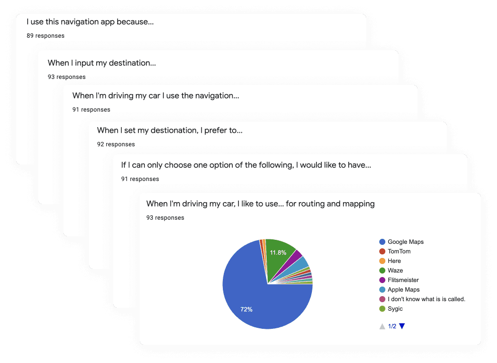
Benchmarking and user research made the central risk clear: competing with familiar navigation tools would only work if Lightyear added something uniquely useful.
This project has been one of my most challenging endeavors. At the outset, the technology we needed to use was very unclear. We had to figure out which maps to source, who would be responsible for routing and planning, and what we could handle in-house.
While working on these issues, I began to develop concepts based on our key features. I created various high-fidelity prototypes and ran user tests to refine our ideas. By the time we were ready to start implementation in the summer of 2022, we had a priotised list of Jira tickets ready to go.
At launch, we had our V1, which was capable of fully planning a trip, providing turn-by-turn directions, and checking charging stations in the vicinity of your search result. We could finally test in the real world.
Results and lessons learned
While we were unable to test our work on many customer vehicles, we’ve learned some valuable lessons for our next project. Here are some of the things we plan to do:
Establish trust with the driver by indicating whether they can make it to their destination and where charging opportunities are available.
For complex navigation planning, the driver can use their phone or laptop.
While we can show the EV horizon, it shouldn’t be the start screen.
Consider showing location waypoints on the map based on the driver’s agenda.
Provide a way to show destination chargers, including their availability and charging speeds.
Display nearby facilities on the map near charging stations.
Allow planning to be done the day before, so drivers can see where and when they will stop.
Especially for our car with twice the range of our test participants, focus on where the driver wants to pause, rather than where the car wants to charge.

Lightyear 0
Role
Interaction design, user testing
Scope
Comfort · Safety · Energy use
Context
Vehicle interface refinement
Case study
My contribution
Benchmarking, user research, information architecture, user flows, Hi-Fi prototyping, user tests, stakeholder management, implementation support
Design challenge
The goal was to make comfort settings easier to understand at a glance, especially in a vehicle where every energy decision matters.
Our electric car is incredibly efficient. Unlike traditional ICE cars that emit heat from burning fossil fuels, our car doesn’t want to waste any energy. So while you can use that excess heat to warm up the cabin in an ICE car, we need to use all of our energy to make the car go as far as possible. This presents a major challenge for solar electric vehicles.
We also found that climate control systems in cars are unnecessarily complex compared to those in our homes. People often want more control in their cars, even if it isn’t necessarily simpler or better.

Product key features
Looking to strike a balance between simplicity and control, we designed our climate control app with a vision to deliver both.
One aspect that I particularly appreciated was the use of motion and animation. We decided to use a color transition to indicate the on/off state – red for off and green for on. However, we didn’t want either of these colors to be the default state since it could cause distractions while driving. Thus, we made it possible to change settings without needing to look at the controls.
If users wanted more control, such as when they entered the car during heavy rain, they could simply tap the temperature button for additional options. We made sure to use large buttons that were at least 2×2 cm in size, making it easy to use. one of the things I really liked was the use of motion and animation. We opted to use a color change between the states. Red to turn of. Green to turn on. But the default state wouldn’t be any of these colors. therefore, we found, without looking settings could be changed while driving.

Top 5 goals
What I wanted to achieve
Process
The most successful version balanced stakeholder needs, safety constraints, and real user expectations instead of optimizing for minimalism alone.
Creating an app for climate control may seem straightforward, but in reality, there are many improvements that can be made. During development, we faced challenges in aligning with different stakeholders, particularly the Thermal Management System (TMS) team who were focused on squeezing out an extra 1% efficiency from the system.
This resulted in the development of complex interactions that did not prioritize the user experience. In order to strike a balance, we invested significant time in creating numerous prototypes and testing them with users to determine the optimal design. Ultimately, we found that sticking with the old system was the best approach.
Results and lessons learned
The work shifted from a low-contrast minimalist concept toward clearer states and stronger feedback — a better fit for confidence, safety, and quick comprehension.
We initially designed our pre-production climate control app with a minimalist approach in mind, aiming to reduce any unnecessary distractions. However, we discovered that the on/off status of certain features was unclear, which led us to make improvements in a later release. We increased the visibility of these features to ensure a more intuitive user experience by making the settings have a higher contrast.
In the upcoming version of our app, we should prioritizing a user experience that feels more personalized to your home environment. Additionally, we aim to implement features that allow the car to determine the optimal level of comfort based on various factors, such as the season and the type of clothing worn by the user. For example, the car should recognize that being fully dressed for winter in a 21-degree environment feels different than wearing summer clothing in the same space. By incorporating these variables, we strive to make our app smarter and more attuned to the needs of our users.